Posts

Showing posts from March, 2020

Project 2 Critiques

Kelsey's project came out outstanding. I think she did a really well job on finding a lot of found materials to make it look more like scrap book collages. My favorite one is the blue/blew pictures because of the way she angled the flowers in the blew image and how it really creates that feeling of something being blown by the wind. I also like how the texture from some of the material in the blue image looks. There isn't much she needs to work on, but if I could give any advice it would be to put less orange in the background of the date collage because I think it draws attention away from the orange in the actual number of the date. In the nail polish collage I think the white on the edge of the nail polish's could've been cut a little more neat. Lastly, maybe just doing a little less detail may have benefitted you. Jacob did a nice job on the image of the two people of the joint. I like the background and how it appears texturized and blocky. I also think he did a ...
Artist Research

Jim Campbell, is a contemporary San Fransisco based artist that is known for his LED light works. Campbell started in film making then moved to electronic sculpture, and is currently working with film, sound, and LED light installations. Campbell uses light in a unique way. He tends to choose a darker background then use bright colored lights on what appears to be the top of his work. I chose to research Campbell because when I saw his art the light speckles really grabbed my attention. I haven't seen any work like this before and it is definitely a change from what we have learned about in class so far and the artists we have looked at. Below is an attachment to a video that describes how he creates his work and hows us images of the pieces.  https://www.sfmoma.org/artist/Jim_Campbell/ Robert Gober, another artist I chose to research creates sculptures that explore sexuality, nature, relationships, politics, and religion. Gober focusses his work on memories from his childhood...

Project 2- Homonyms

Image
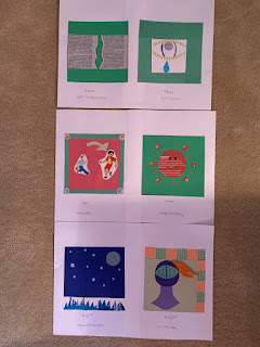
For this project the homonyms/homophones/homographs I chose have no direct correlation, they are are uniquely different. I chose tear for a tear in the newspaper and then a tear drop coming down from an eye. I used newspaper, found pink paper, and a lara bar wrapper for the first image. Then for the tear drop I cut out the wrapper of a powerade bottle, used some felt for the eye lashes, found paper for around the eye and eyeball. I chose split complementary because I thought those were three simple colors that would represent a tear in a newspaper the best, allowing the tear the really stand out with the pink paper. Analogous was chosen for the tear because I wanted to use blue, but didn't want too many colors gong on at once, so the bright green helped me emphasize the eyelashes without taking away emphasis on the bright blue teardrop. Next, I chose to do son and sun. I found stickers that fit perfectly to portray a father and his son. I used a green arrow of found paper to po...

Commenting on Phoebe's Artist of Choice

I have never heard of Sandy Skoglund before until I saw phoebe's blog post. I'm glad she shared the piece titled, Revenge of the Goldfish because of its unique way of incorporating several goldfish into a scene in a bedroom. It doesn't fit at all, but somehow creates depth and makes you think more deeply about the work. This piece of art reminds me of another work that I saw in the Tampa Museum of Art in the Fall and instead of goldfish all over the room, it was red socks covering a kitchen scene.

My Current Status

I am currently about halfway done with Project 2. I am struggling a little bit with trying to find colors to insert as my background because for some of my squares so far I have already incorporated the details before I put something down as the background. Other than that I think I should be okay with finishing this project.

Paper Cutting Artist- Kara Walker

Image
Kara Walker is the artist I chose to blog about.  Kara Walker is an African American artist that is one of the most prolific artists of her generation. She has gained national and international recognition for her cut-paper silhouettes that depict historical narratives that are preyed upon by sexuality and violence. Kara Walker uses color in her pieces very vaguely. She works with more of a grey scale and blacks and whites which I find really interesting. Walker's art seems pretty simple, yet at the same time conveys a deep, powerful meaning behind it. Since she focuses her work on such serious events, I think using the black silhouette cut-outs is the best way to show off.  Walker is very passionate about her work and wants the viewer to truly dig deep and try to understand the meaning behind each individual piece of art. Walker says, " I think really the whole problem with racism and its continuing legacy in this country is that we simply love it. Who would we be without...

TMA Visit

Image
 This next piece is a beautiful Egyptian piece that tells the story of a woman who passes away and then describes her afterlife. There is such exquisite detail in this piece with the bottom half by the legs. I think this was done with a fine paint brush and an extremely focussed hand. It probably took the artist an incredible amount of time to complete. This sculpture shows the colors on the color wheel that resemble tetradic colors. There seems to be a rough texture in the face on the head of the figure. This piece grabbed my attention because of it's size. It was life-sized which I found incredible.  The Pieces in this image were all handmade from Haiti. They came from humble beginnings of bags that were discarded. They were also hand stitched as well, which is something you don't see all the time nowadays. The time and patience that was put into these cloth makings show how much effort and focus this artist had while making them. My favorite out of these four is ...