Project 2- Homonyms
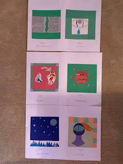
For this project the homonyms/homophones/homographs I chose have no direct correlation, they are are uniquely different. I chose tear for a tear in the newspaper and then a tear drop coming down from an eye. I used newspaper, found pink paper, and a lara bar wrapper for the first image. Then for the tear drop I cut out the wrapper of a powerade bottle, used some felt for the eye lashes, found paper for around the eye and eyeball. I chose split complementary because I thought those were three simple colors that would represent a tear in a newspaper the best, allowing the tear the really stand out with the pink paper. Analogous was chosen for the tear because I wanted to use blue, but didn't want too many colors gong on at once, so the bright green helped me emphasize the eyelashes without taking away emphasis on the bright blue teardrop.
Next, I chose to do son and sun. I found stickers that fit perfectly to portray a father and his son. I used a green arrow of found paper to point towards the son. The stickers in the corner were another nice touch to bring in the sticker theme in this collage. I chose tetradic because I thought the more colors for this collage the better, showing off more of a happy vibe. The sun collage on the other hand was done using some written on found material then for the ryas I used red found paper and more of a lara bar wrapper. I then cut out black paper from the newspaper and created a face for the sun to bring more life into the picture. I thought choosing complementary would give me two solid color choices and that is all I wanted for this image.
Finally, I chose night and knight. I went for a night time scenery using a rice crispy treat wrapper to create the grass, then blue paper from a newspaper for the moon, and I had star stickers in my house that I used. I like the depth this collage created. I chose monochromatic because blue's were the best color to fit this night time picture in my opinion. The knight on the right was made out of found paper in my basement. I used orange felt for the knights hair, and found scrapbooking squares for the border to bring in more of the triadic color theme for this collage.
I thought that my collages were unique. I like the stickers I used for some of the images because I think it brought out a different look for this assignment. My favorite collage is the knight. I like how clean it came out and the border I used. The orange felt hair was definitely a boost to this image. I think I could've worked on the sun more in order to make it pop, but at the same time I was going for a more simple look there. Overall I am content with my work for this project.


Comments
Post a Comment